CLIENT
Intellect (Asia’s largest mental health company)
ROLE
Product Designer
SERVICES
Product Design / Visual Design / User research / Product Management

Intellect is a modern-day mental health company with a mission to make mental healthcare & wellbeing support accessible for everyone. It is Asia’s largest mental health company with over 3 million users on its mobile app.
As one of the inaugural design team members, I helped launch the design team and establish a design workflow, audited and improved on existing design features, and collaborated with the Product & Development teams to prioritize and design new features.
DESIGN TEAM INITIATION
Design Workflow
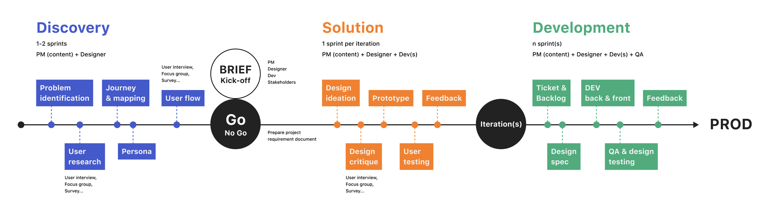
We worked closely with the Product Manager to identify and prioritize design features, develop product requirements, and iterate on designs with the PM, development team, and users. After features were launched, we continued the cross-functional collaboration for QA and testing, and also monitored data analytics to understand the impact of the feature on KPIs such as user retention, conversion, etc. and iterated accordingly.
Design Audit
One of our first tasks was to perform a design audit of the current app to identify bugs, usability and accessibility issues, and areas of improvement. We prioritized the list of bugs and usability & accessibility issues for the Development Team to address before diving into the design and development of new features. Here are some examples:

Accessibility - text and background colour do not meet WCAG accessibility standards.
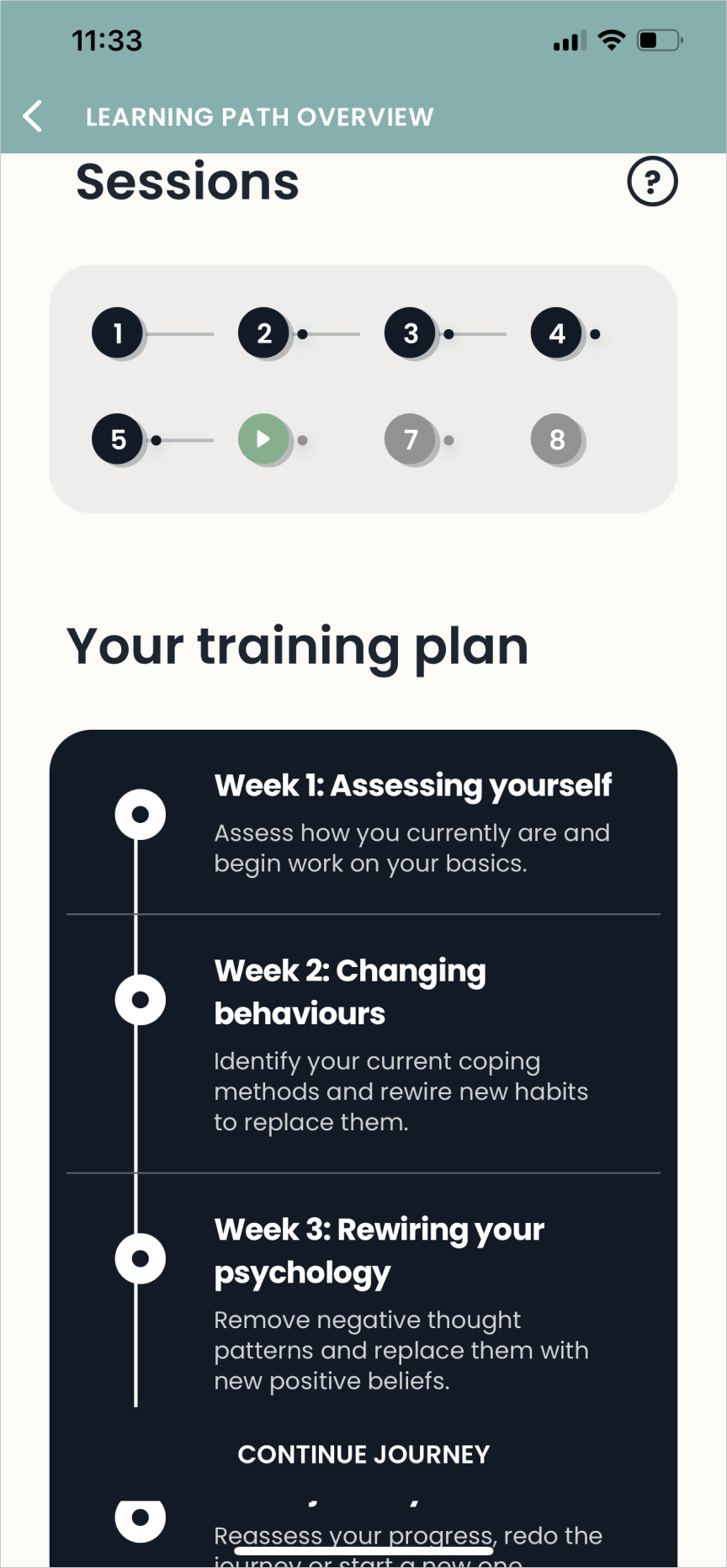
Usability - Unclear what dots indicate in Session Tracker; Training Plan weeks are confusing as they don’t correspond to the dots; can’t see button against background.
User flow - After completing onboarding, should the user start with “Start your journey” or “Start new path”? Difference is not immediately clear. When you click “Start new path”, it brings you to “Your journey” which makes it more confusing.
Design System + Rebrand
Before we arrived, there was no established design system or components. We created an entire design system in Figma from scratch using the Atomic Design Methodology which included the following:
Atoms: Button, Anchor, Chip, Input dialog (iOS), Radio button, Checkbox, Switch (toggle), Badge, Divider (separator, section header, spacer), Tooltip (up, left, right, down with different size), Popover, Selection list (multiple choices, allow multiple selection or not), Dialog. Ticker (normal ticker, full-width ticker), Cards, Label, Page Control, Progress Bar, Loader, Toaster
Molecule: Search bar, TableView cell, Label, Disclosure, Audio player, Calendar, Coachmark, Date Picker, Dialog Box, Accordion
Organism: Navigation bar, Tab bar, TableView / List, Empty State, Header
Templates: Search page, Empty States, Session page, Cover, Content
Page: Home page, Task page, Coach page, Profile page
REBRAND
We established the design system so that the design and dev teams could iterate on new and existing features in an agile and properly documented way. However, I simultaneously set out to rehaul the entire design of the app as the graphic style was outdated. I got inspiration from user testing and competitor apps. We wanted to stage the rollout of the new design instead of doing a “big bang” rehaul as the dev effort would be too high. Here are some examples of the rebranded screens:
Old Designs


New Designs
In addition to to improving existing features, I also led the design of a number of new features. The prioritization of these features was informed by user research and business priorities. Here are a few:
NEW FEATURES

Mood Tracker & Recommendations
From graphics to flow, I designed the mood tracker that users can fill in daily to capture trends and insights of their wellbeing over time. At the end of the mood tracker, users are presented with recommended sessions to do next that are tailored based on their answers.


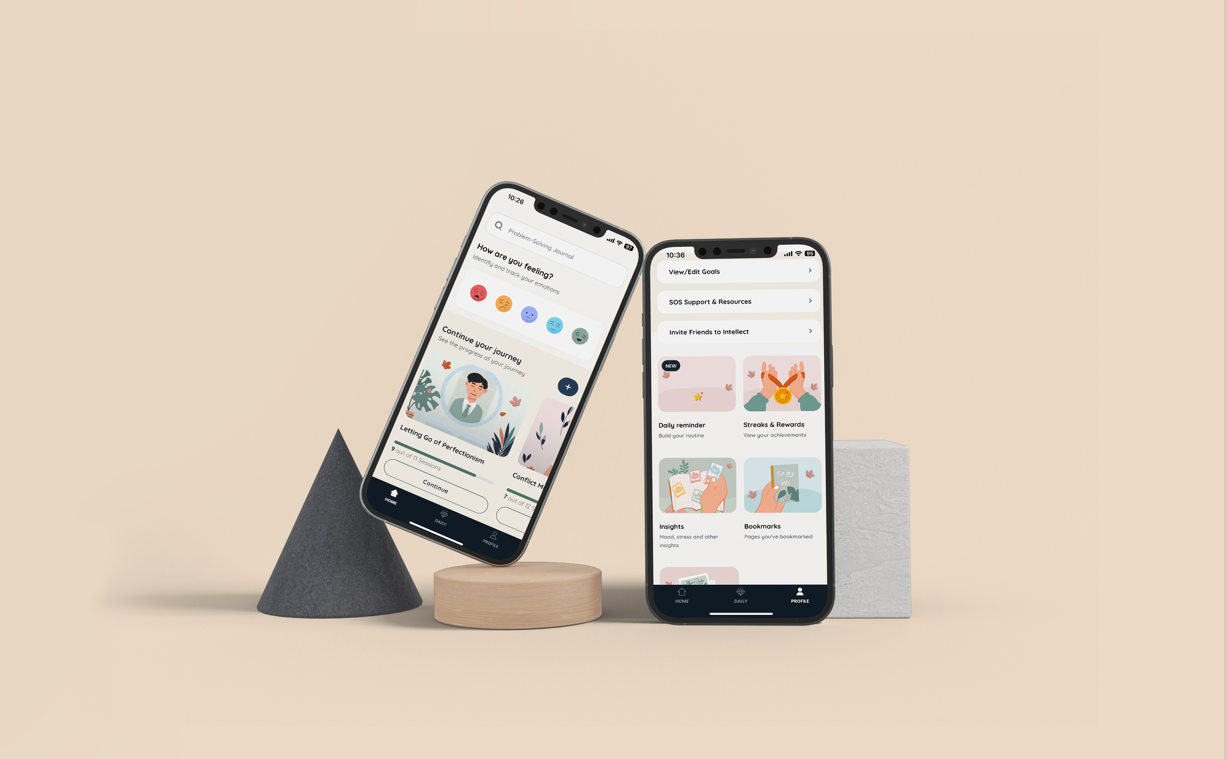
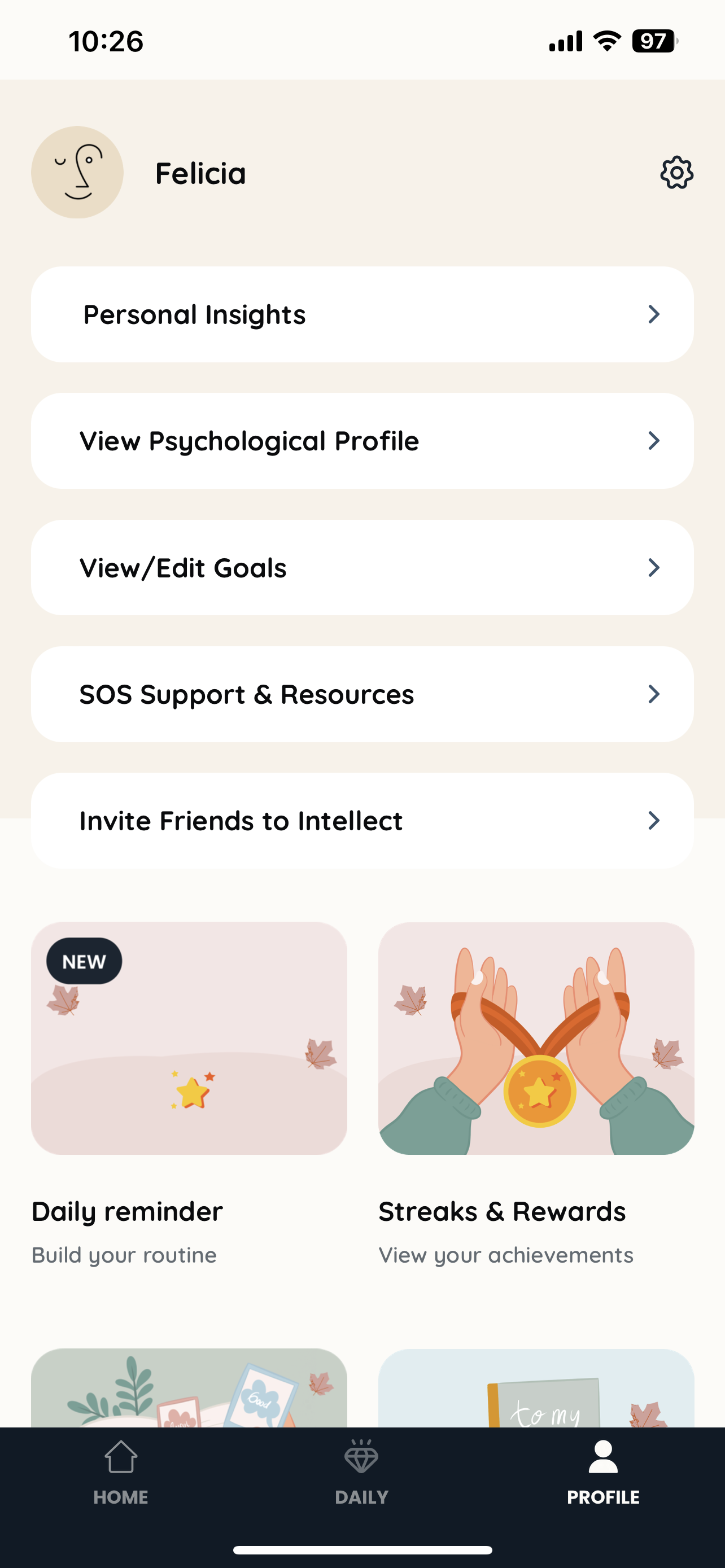
Profile, Streaks & Rewards, Journal Log
I helped redesign the layout of Profile and Sreaks & Rewards screen. I also added a “Bookmark” feature so users could save and access sessions they liked.
I also redesigned the Journal Log and added date filters and a calendar view.

Daily Reminders
To improve stickiness, I designed a flow to set up a daily reminder notification to do a wellness exercise/reflection. The user selects an existing recurring behaviour (e.g., eating breakfast) they can “tack on” to, so they build on top of habits more easily.
Paywall
I led the design of the paywall for Intellect’s mobile app. To start, I identified best practices and things to avoid when it came to paywall design. I shared this with the Co-founders & Design team to ensure alignment on the vision for our paywall.

I conducted a competitive analysis to understand the common practices and pros/cons of different paywall strategies. To balance business objectives and an optimal user experience, we decided on a freemium paywall with the following features:
A new/non-subscribed user can access a certain amount of content but needs to upgrade to unlock more. This freemium model allow users to experience the value of the app before making more commitments.
To entice the user to subscribe, we will offer a free trial for them to explore the value of the app. Users can cancel their subscription any time before the trial ends, and the paywall will contain clear instructions on how to do so.
I also defined various placement points for the paywall throughout the app and mapped out the flow:

I then created multiple versions of the paywall with content that emphasized different messages:
Full / unlimited access to of learning paths, rescue sessions, analytics.
Benefits to the user (e.g., improving productivity, caring for yourself, feeling calm, understanding yourself)
Clear, transparent steps of the subscription process
Free trial as a generous offer before committing to monthly/annual payment
I also leveraged different behavioural science concepts to test/improve conversion rates:
Selecting the monthly plan by default, and either displaying the other subscription options in the paywall or hidden behind a link to a modal with additional options
Social proof by indicating the most popular plan
Finally, we tested out different subscription models, such as:
7 or 14 day free trial for monthly and annual subscriptions, respectively
Free trial for annual subscription only
Lifetime subscription (one-time payment and best value)

I worked closely with the Product Manager to create a detailed user flow and identified product requirements. Initial implementation of the paywall revealed a 3-4% conversion rate which was in line with market standards. Throughout the next few months, we continuously modified the content and subscription options and conducted A/B tests to identify the designs that would lead to the highest conversion rates.
Other design work
We were a rapidly scaling start-up (user base grew from 1M to 3M & team quadrupled in six months) so we moved fast and worked on multiple projects simultaneously. While I didn’t cover them all in this case study, here’s a list of additional work I did. If you want to know more, just reach out :)
Information architecture redesign
Removed “Tasks” tab, replaced with “Daily Exercises”
Home page architecture
Telehealth / Coach feature
Coach selection
Scheduling & video conferencing
Messaging
Weekly & Monthly Insights
Onboarding flow
IMPACT
Increased daily sessions per active user & average session length after implementation of Recommendations and Daily Reminders
Improved retention rate
Increased daily & monthly active users (DAUs & MAUs) and stickiness
Paywell generated 3-4% conversion rate
SKILLS DEVELOPED
Product design
Product management
A/B testing
INSIGHTS
Create reusable design components from the beginning to save dev efforts later on
A combination of qualitative & quantitative data is most fruitful in informing design decisions
To build a case for your design, tie it to key KPIs